Dark and moody edits can transform a simple portrait into something cinematic and powerful—but if your edit is looking flat, lifeless, or just solid brown, you’re not alone. Many photographers struggle with achieving the right balance of contrast, color, and depth to make their moody edits pop.
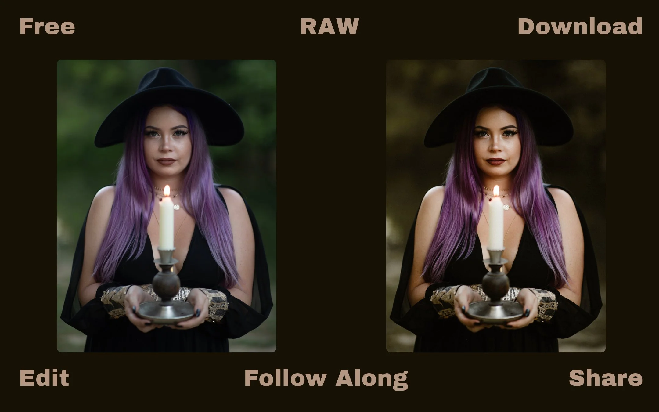
💡 Follow Along: Download the RAW file for free and edit alongside me to get these exact results—or take it in your own creative direction. If you do, tag me in your edits! I love seeing different takes on the same image.
Why Do Dark & Moody Edits Look Muddy?
Before we jump into fixes, let’s talk about why this happens in the first place.
Common Reasons for Flat or Muddy Moody Edits
1️⃣ Slapping on a preset and expecting perfection.
Every image has unique lighting, so presets are just a starting point—not a one-click solution.
2️⃣ Lack of contrast & poor highlight/shadow balance.
If shadows are too bright and highlights aren’t emphasized, the image looks flat.
3️⃣ Color contamination from ambient lighting.
Different light sources (natural vs. artificial) cast unwanted color tones that need correcting.
4️⃣ Over-saturation or desaturation of skin tones.
Too much contrast boosts saturation, making skin look unnatural, while too much desaturation makes it lifeless.
5️⃣ Cool vs. Warm Tones Aren’t Balanced.
Moody edits often lean warm—if your white balance is off, the image can feel too cold or muddy.
Step-By-Step: Fixing a Flat & Muddy Moody Edit
Step 1: Apply a Preset & Analyze the Image
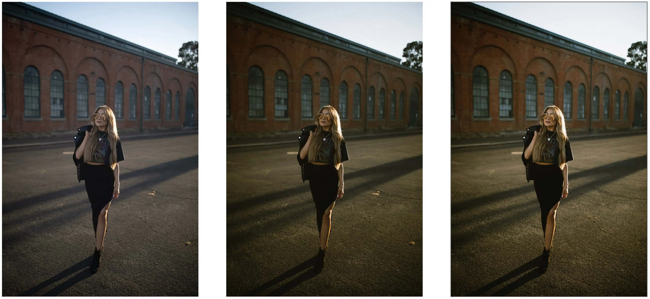
Before doing anything, apply a dark & moody preset. In this case, we’re using “Lost Woods”, which has a high-contrast cinematic look.
❌ Mistake: Many photographers apply a preset and move on.
✅ Fix: Presets are just a starting point—we need to tweak them for lighting conditions and subject tones.
Step 2: Adjust Exposure, Highlights & Shadows
📌 Start in the Basic Panel to refine brightness and contrast.
• Increase Highlights (+45) → Brings back brightness in key areas.
• Lower Shadows From The Preset (+26) → Adds contrast without crushing details.
• Increase Whites (+72) → Helps create depth in a naturally flat image.
✅ Why This Works:
• Highlights & whites add pop while shadows anchor the depth.
• Avoids the common mistake of making everything dark without defining separation.
Step 3: Control Color Saturation (Fixing Oversaturated Skin Tones)
📌 As you add contrast, colors naturally become more saturated.
• Navigate to the HSL Panel (Color Mixer)
• Lower Orange Saturation (-28) → Prevents overly orange skin tones.
• Lower Green & Yellow Saturation (-60 , -71) → Removes distracting background tones.
✅ Why This Works:
• This ensures rich contrast without unnaturally boosted colors.
Step 4: Adjust White Balance for a Warm Moody Look
📌 Dark & moody edits often lean warm, so adjusting the temperature is key.
• Increase White Balance → 7900
• Why? → Warmer tones feel more moody and inviting.
✅ Why This Works:
• If the image feels dull, it’s often because it’s too cool-toned.
• Slight warmth keeps skin tones glowing while maintaining a moody feel.
Step 5: Using Masking for Extra Depth & Pop
📌 To separate the subject from the background, we can use masking.
• Go to the Masking Tool → Select Background
• Lower Exposure (-0.1) for the background → Makes the subject stand out.
• Lower Highlights (-100)
💡 Pro Tip: Use the Subtract Linear Gradient Tool to soften the transition at the bottom of the image, creating a natural depth effect.
✅ Why This Works:
• Helps the subject pop naturally without looking like a cut-out.
Step 6: Tone Curve for Finishing Touches
📌 The Tone Curve helps refine contrast at a deeper level.
• Add a slight lift in Highlights → Creates a polished pop.
• Subtly fade the Shadows → Adds a filmic, moody vibe.
✅ Why This Works:
• The Tone Curve fine-tunes depth and richness beyond basic contrast sliders.
📌 Key Takeaways:
✅ Don’t rely on presets alone—adjust for lighting & contrast.
✅ Use masks to create depth & separation.
✅ Adjust white balance & saturation for cleaner skin tones.
✅ Fine-tune with the Tone Curve for extra pop.
Final Thoughts: Keep Experimenting!
Moody editing is an art, and every image is different. The more you experiment, the more confident you’ll become in adjusting contrast, color, and light.
🔥 If this tutorial helped you, share it with a fellow photographer!
📸 Want more editing tips? Subscribe & stay tuned for more Lightroom guides!