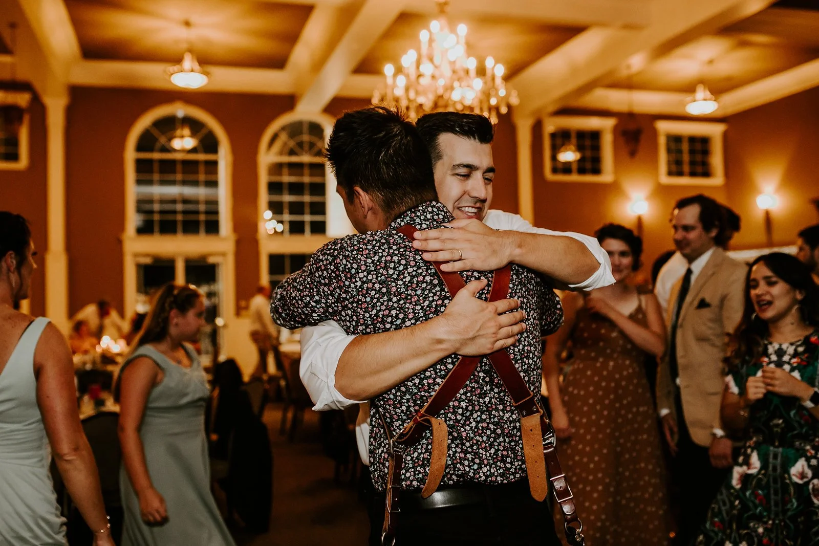

In today’s tutorial, I’m breaking down exactly how I edited this neon-lit arcade portrait to achieve a deep, cinematic contrast with rich, moody blacks and a refined color grade.
We’re talking Stranger Things, Inception, neon dream vibes—but with natural skin tones and balanced colors. This edit enhances the atmosphere while keeping details sharp and crisp.
💡 Follow Along: Download the RAW file for free and edit alongside me to get these exact results—or take it in your own creative direction. If you do, tag me in your edits! I love seeing different takes on the same image.
Now, let’s get into it!
Step 1: Composition & Crop Adjustments
Before diving into colors and tones, I always check my composition first.
✔ Open the Crop Tool (Shortcut: R)
✔ Cycle through different grid overlays using O
✔ For this shot, I used the rule of thirds, placing the model’s nose near the top intersection for balance.
✔ Tightened the frame slightly to draw more attention to the subject.
Composition adjustments set the foundation for a stronger, more intentional image. Even after cropping, you can always tweak it further as the edit evolves!
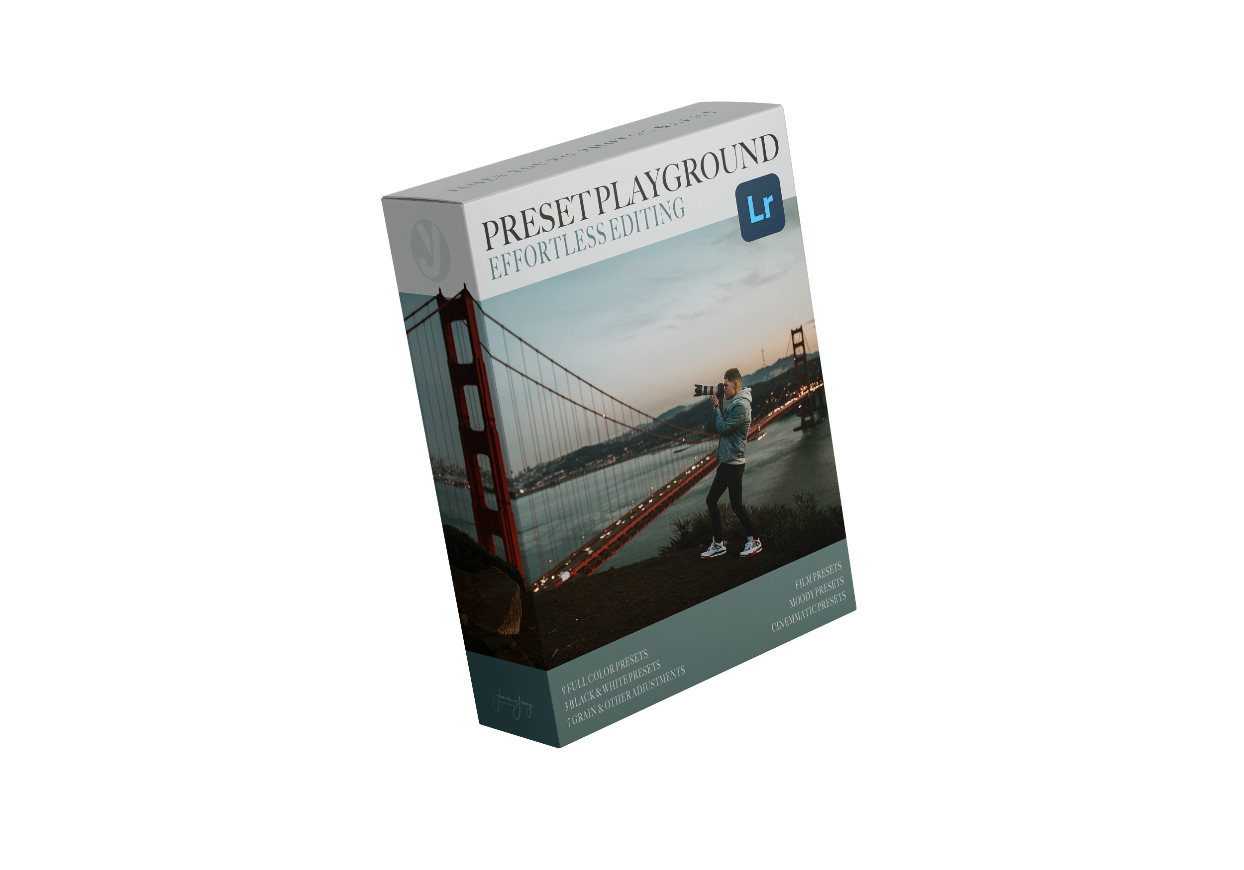
Step 2: Choosing the Right Preset
Now that we’ve got our composition locked, it’s time to choose the color direction.
I go through my Preset Playground to preview different looks quickly:
✔ Forks Washington – A nice, dark moody look.
✔ Watermelon Sugar – A glowing, poppy, vintage film feel.
✔ Date Night – Cinematic Vibe – The winner for today’s edit.
✅ Why “Date Night – Cinematic Vibe”?
• Lowered contrast for a softer film-like look.
• Muted highlights to control bright neon tones.
• Lifted shadows to preserve details in darker areas.
• Rich blacks to maintain that cinematic depth.
• Cooler split toning for a stylized, movie-inspired finish.
💡 At this point, I encourage you to experiment with different presets! Every image can go in multiple directions—so don’t be afraid to try various looks before committing.
Step 3: Adjusting the Base Tones
Once the preset is applied, I make fine-tuned edits to fit the image better.
Tone Adjustments
➡ Contrast (-4) – Softens overall contrast for a more organic feel.
➡ Highlights (+4) – Slightly increased to bring back some neon pop.
➡ Shadows (+21) – Maintains detail while keeping the mood.
➡ Whites (+6) – Adds a subtle glow to the brightest spots.
➡ Blacks (-46) – Deepened for maximum cinematic impact.
✅ What This Does:
• Keeps neon lights balanced without overexposing.
• Enhances depth while preserving shadow details.
• Maintains a soft, movie-like contrast without looking too digital.
Step 4: Enhancing Texture & Midtones
➡ Texture (+13) – Adds sharpness to key details like fabric, hair, and eyes.
➡ Clarity (-4) – Softens midtones slightly for a dreamy, cinematic feel.
➡ Dehaze (0) – Left neutral, since neon lights don’t need extra haze.
✅ Why This Matters:
• Texture helps retain details without over-sharpening.
• Clarity softens any harshness for a smoother, filmic finish.
Step 5: Dialing in the Colors (HSL Adjustments)
Now for the fun part—color grading. This step defines the entire mood of the edit.
Hue Adjustments
✔ Reds & Oranges (-10, -11) – Warmer skin tones.
✔ Aqua (+25), Blue (-25) – Balances cool neon tones.
✔ Purple & Magenta (+30, +17) – Enhances neon purples.
Saturation Adjustments
✔ Slight boost to Red, Orange & Yellow for skin tones.
✔ Lowered Green, Aqua & Blue to keep neon tones from overpowering.
✔ Purple & Magenta slightly increased to make them pop.
Luminance Adjustments
✔ Orange & Yellow (+23, +15) – Keeps skin tones glowing & natural.
✔ Purple & Magenta (+28, +16) – Boosts the vibrancy of neon lights.
✅ Why This Matters:
• Color contrast is key in a cinematic look.
• Cool shadows + warm highlights = natural but stylized aesthetic.
• Neon colors stay vibrant without over-saturating.
Step 6: Cinematic Split Toning
✔ Shadows: Cool Blue (Hue 214, Sat 12) → Gives the dark areas a stylized film look.
✔ Highlights: Soft Purple (Hue 224, Sat 5) → Adds a gentle glow to neon accents.
✅ What This Does:
• Adds depth and separation between highlights & shadows.
• Keeps colors looking stylized yet natural.
Step 7: Refining Details (Sharpness, Grain & Vignette)
✔ Sharpness (70), Edge Masking (43) – Ensures crispness without overdoing it.
✔ Grain (22, Size 9, Frequency 50) – Adds a subtle film-like texture.
✔ Post-Crop Vignette (-5) – Darkens edges slightly for better subject focus.
✅ Final Tweaks:
• Turned Lens Corrections OFF for a natural lens character.
• Applied “Fine & Rough” grain preset to enhance the filmic feel.
💡 Bonus Tip:
If you want to go full cinematic, try cropping to 16:9 for a true widescreen effect.
Final Thoughts: Bringing It All Together
🎞 The final edit is all about:
✔ Cinematic depth with soft contrast & rich blacks.
✔ Balanced neon tones while preserving skin tones.
✔ Refined color grading inspired by film & Hollywood aesthetics.
This could have gone in many directions—that’s why experimenting is so important. If you try a different look, I’d love to see it!
✅ Tag me when you post your edits!
✅ Grab the preset pack & free RAW file.
✅ Subscribe & follow for more editing breakdowns!
Thanks for editing with me—see you in the next one! 🚀