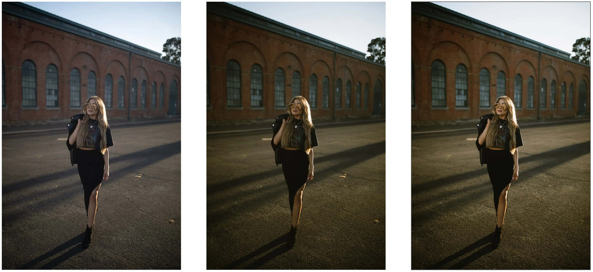
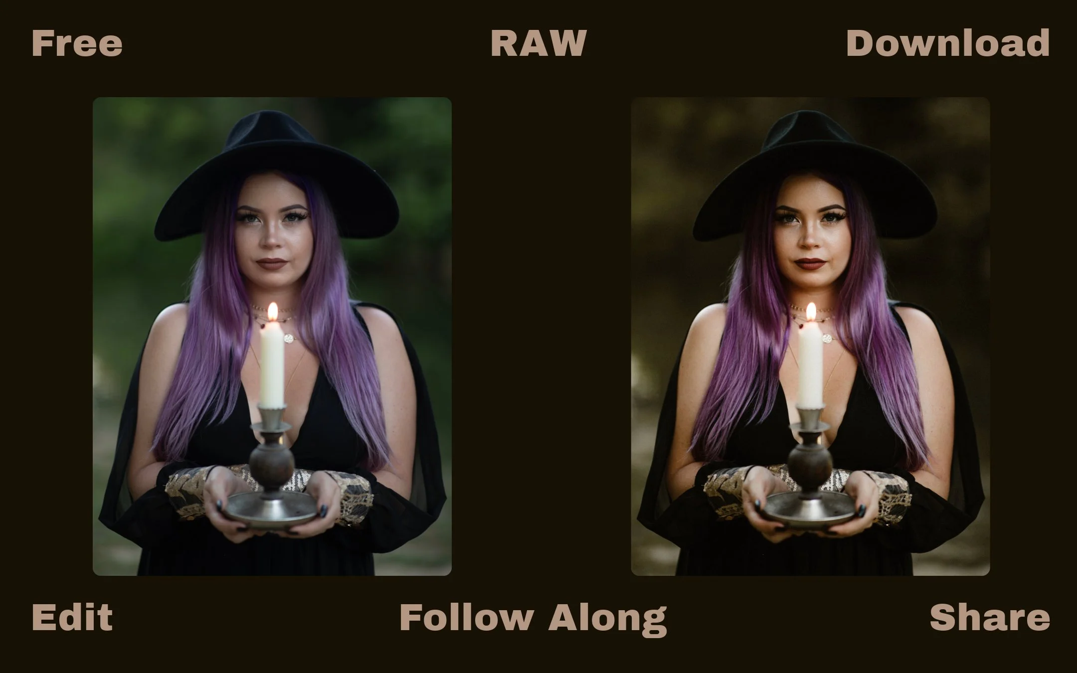
You want to achieve that cinematic, dark and moody look in your portraits? Today, we're diving into an easy-to-follow, step-by-step editing breakdown!
💡 Follow Along: Download the RAW file for free and edit alongside me to get these exact results—or take it in your own creative direction. If you do, tag me in your edits! I love seeing Your Version!

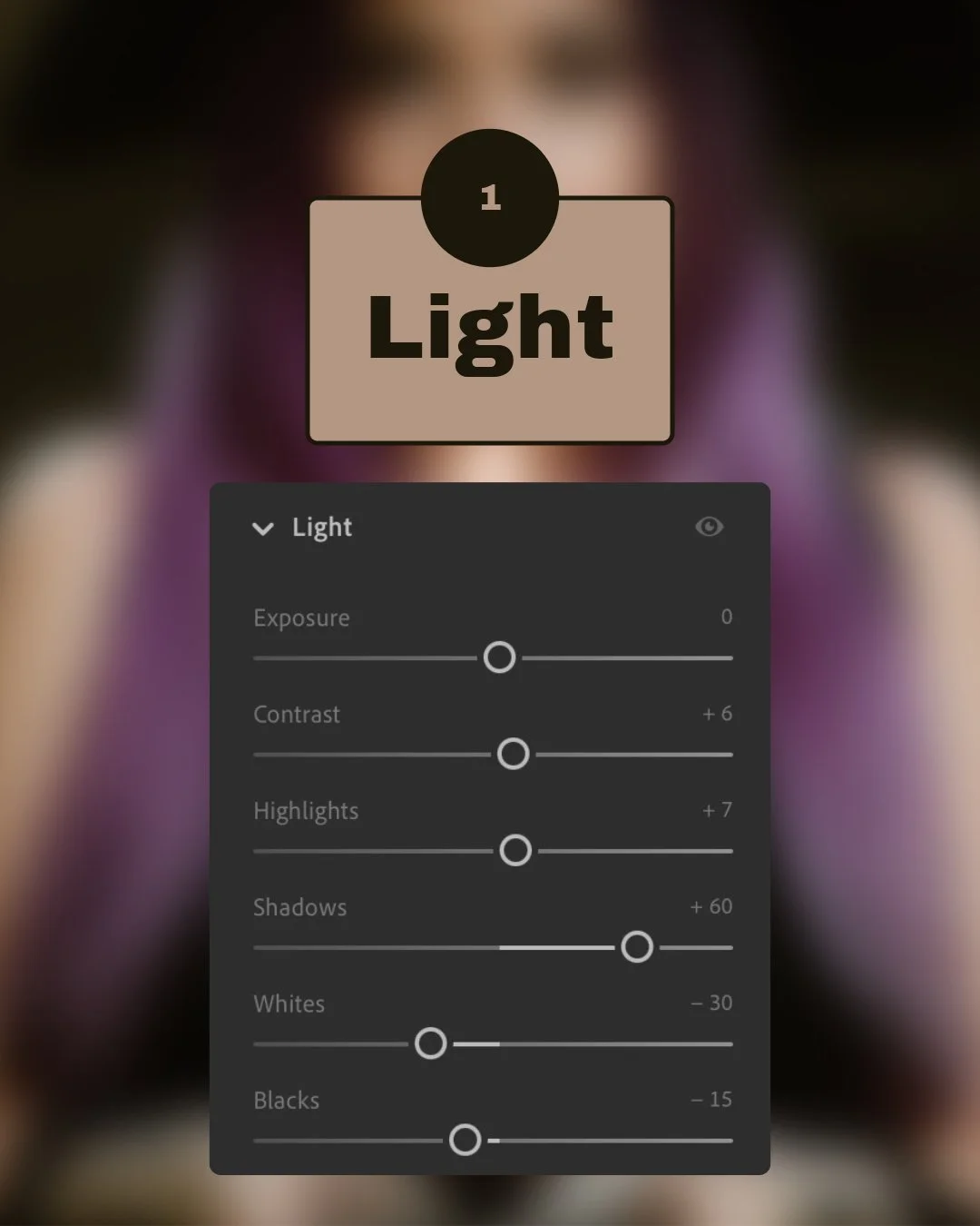
Step 1: Light Adjustments
Exposure: Keep neutral (0)
Contrast: Slightly boost (+6)
Highlights: Slightly raised (+7)
Shadows: Open them up to reveal details (+60)
Whites: Tone down (-30)
Blacks: Bring down slightly (-15)
It's kinda like sculpting with light—you're shaping your subject by carefully adding contrast.
💡 Why it works: These adjustments deepen shadows and gently enhance highlights, creating a cinematic depth and moody ambiance. Try pushing shadows higher or lower to adjust mood intensity.

Step 2: Color Adjustments
Temperature: Warm up the scene (7555)
Tint: Add a gentle pink tone (+18)
Vibrance: Slightly decrease (-8)
Saturation: Reduce subtly (-2)
You're setting the emotional mood here; think of it as your image's color personality!
💡 Why it works: Warmer tones and subtle color reductions add richness and nostalgia. Play around with the temperature to see how different moods emerge.

Step 3: Tone Curves Magic
Apply gentle S-curves on RGB for contrast.
Adjust Red, Green, Blue channels to add a vintage cinematic feel.
The tone curve is your secret weapon to give photos depth and character, kinda like adding your special sauce!
💡 Why it works: Custom curves add dimension and cinematic flair by softly adjusting shadows, midtones, and highlights. Experiment with curves to see the varied stylistic outcomes.
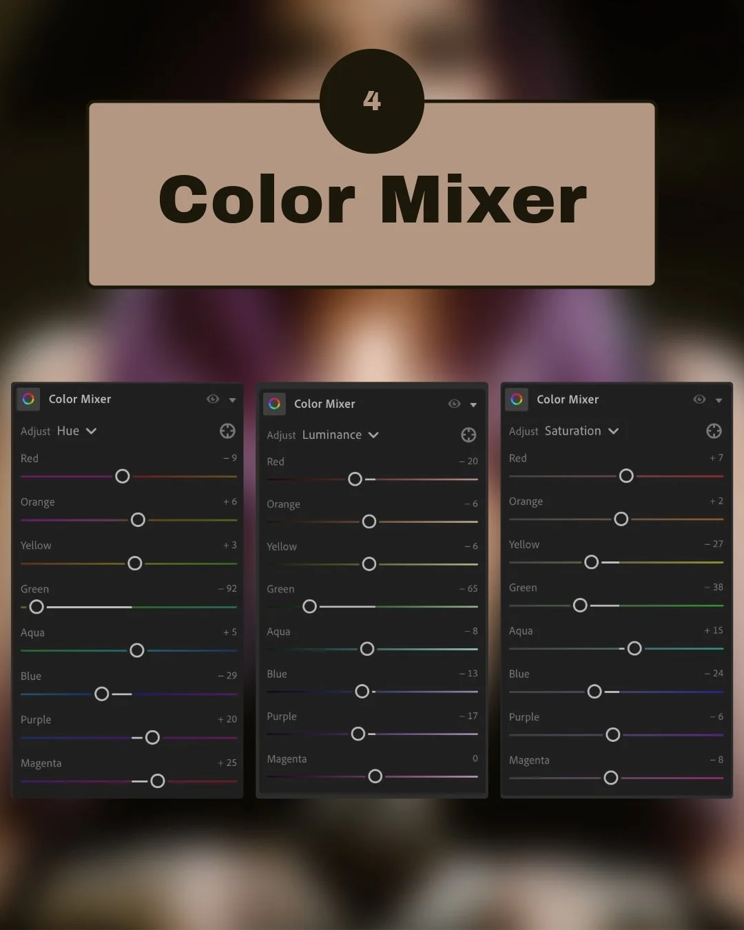
Step 4: Color Mixer Tweaks
Adjust individual colors for subtle refinement:
Reds: Hue -9, Saturation +7, Luminance -20
Oranges: Hue +6, Saturation +2, Luminance -6
Yellows: Hue +3, Saturation -27, Luminance -6
Greens: Hue -92, Saturation -38, Luminance -65
Blues & Purples: Adjust slightly to taste for moodiness.
This part fine-tunes your color harmony—think of it as mixing your custom paint palette!
💡 Why it works: Detailed color tweaks control the visual narrative. Notice how muting greens creates a dramatic effect—try adjusting different colors to suit your style.
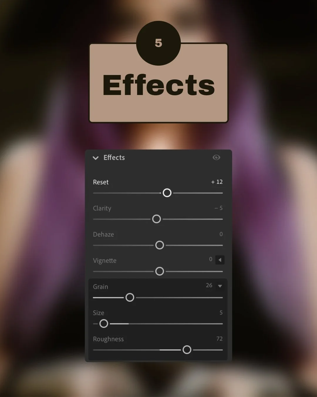
Step 5: Effects & Finishing Touches
Texture: Slightly boost clarity in details (+12)
Clarity: Soften slightly (-5)
Grain: Add a bit of film grain for an artistic touch (26 Amount, 5 Size, 72 Roughness)
Adding grain gives your photograph that timeless, nostalgic vibe. It's like a sprinkle of magic dust!
💡 Why it works: Texture and grain add character and nostalgic charm. Adjust grain amount for a more pronounced vintage or clean look based on your preference.
Get the base preset and make the edit
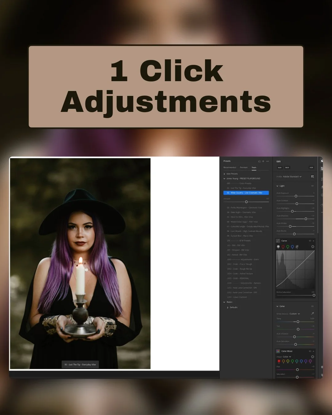
Preset to Final Edit: Quick Breakdown
The Wine Country preset inside of the Lightroom Preset Playground instantly established the cinematic and moody vibe, with its expertly dialed-in tone curve—saving you from the usual headache of curve adjustments.
All it took was about 5 minor tweaks from the base preset to reach the final polished look:
White Balance: Warmed up (6300K → 7555K) for richer golden-hour hues.
Highlights: Adjusted from -20 to +7 for subtle contrast pop.
Shadows: Slight boost from +55 to +60 to reveal more shadow detail.
Greens/Yellows Luminance: Deepened significantly (-21 → -65) for moodier foliage.
Grain: Refined texture by adjusting amount (19 → 26), size (7 → 5), and frequency (50 → 72).
It's kinda like getting a perfectly baked cake and just adding the frosting.
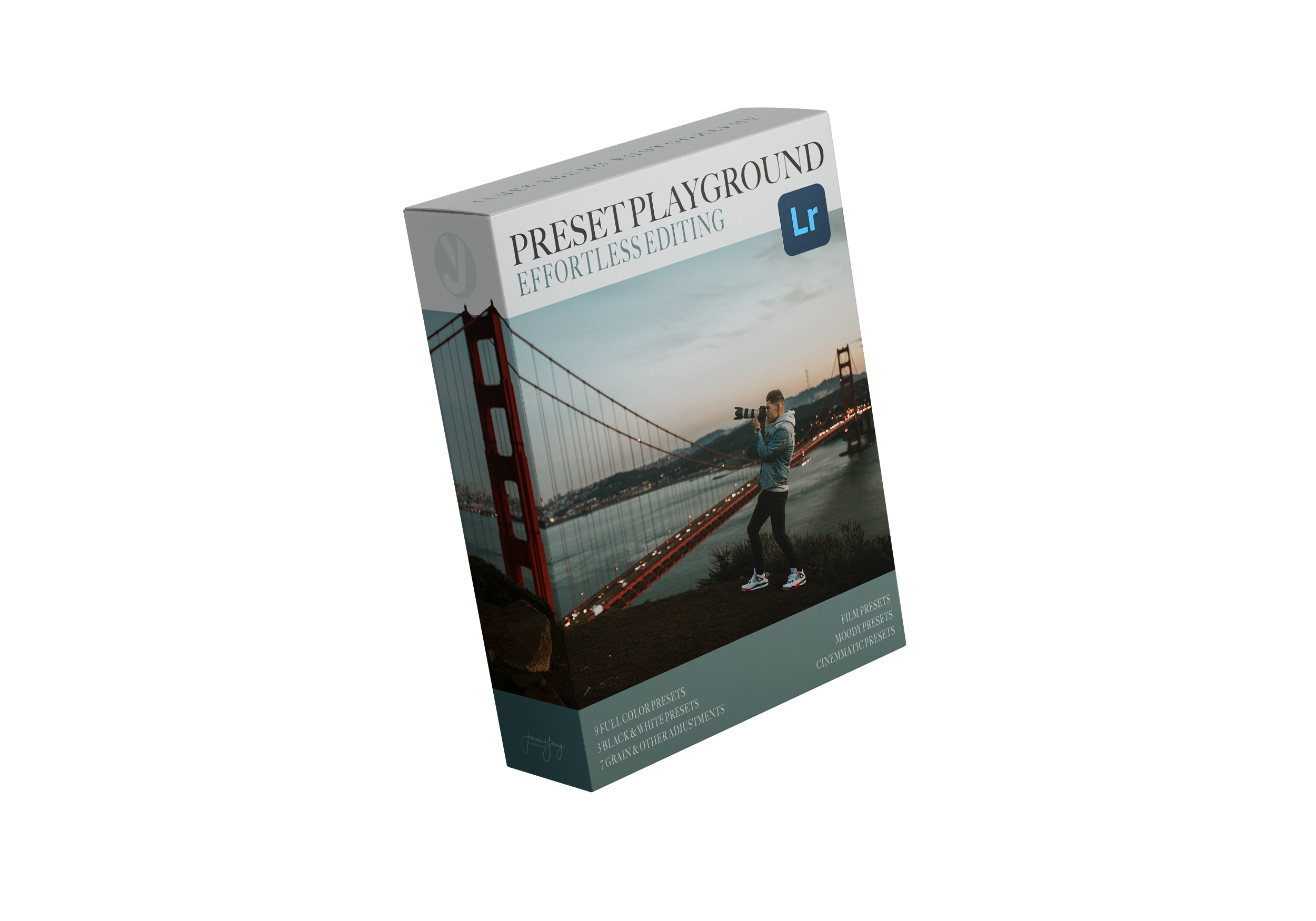
Lightroom Preset Playground
This preset collection includes:
📷 4 Film-Inspired Looks – Kodak-style warmth & nostalgia.
🎥 3 Cinematic Styles – Inspired by real Hollywood color grading. (Including Wine Country… The one we used for this edit!)
🌫 2 Moody, Desaturated Styles – Think Pacific Northwest & rich editorial tones.
3 Black & White Presets – Custom-built for different lighting conditions 🖤
7 Adjustment Presets – Edit Faster & Experiment More 🎛
Every preset has a written breakdown of what it does, why it does it, and how you can tweak it. (No other preset pack offers this level of learning.)
Learn more about the Lightroom Preset Playground.
Final Thoughts
Editing is personal! Use this guide as your foundation, then experiment and make it uniquely yours. Don’t forget to share your results!